Price action in 50 milliseconds, without leaving the table
You are scanning a few hundred rows. One number catches your eye — a delta big enough to be interesting, small enough that you are not sure it is real. So you go and check.
Open the exchange in another tab. Search the symbol. Wait for the chart widget. Set the timeframe. Read it. Come back, and hunt for your row again in a table hundreds of lines long.
That round trip takes seconds, and it happens dozens of times a session. The cost is not really the seconds — it is that you lose your place, and your attention resets. Enough of those and you simply stop checking the marginal cases, which are exactly the ones worth checking.
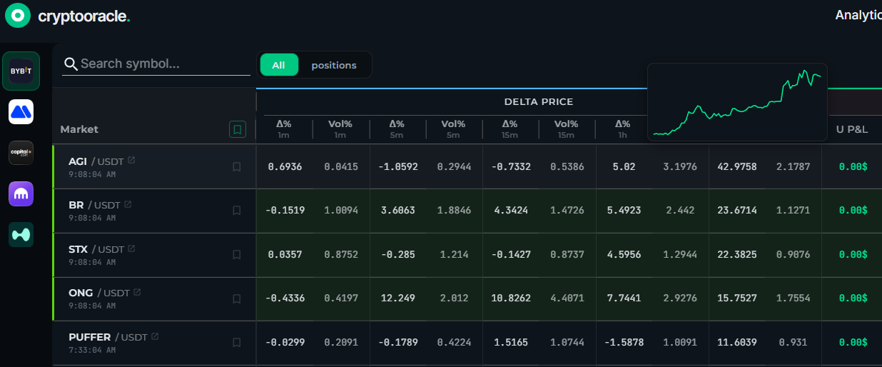
Now it is a hover. Rest the cursor on any number in the monitoring table and the price action behind it appears, drawn from data already in memory. No tab switch, no symbol search, no lost place in the grid.
About 50 milliseconds
The chart is not fetched from an exchange. CryptoOracle already keeps its own continuously updated price store for the metrics it publishes, and the hover reads straight from it. A six-hour series is 832 bytes and arrives in roughly 50 milliseconds on a connection the app already has open.
The popup deliberately waits a fifth of a second after your cursor stops, so sweeping across the grid stays quiet. From the moment you pause on a number to the moment the picture is on screen is about a quarter of a second. Checking a number is no longer a decision — it is just something that happens while you read.
Two charts, two questions
A Δ% cell draws the price line: the shape of the move, not only its size.
A Vol% cell draws something an exchange chart will not give you at a glance — the individual per-candle returns that the volatility figure is calculated from, with a shaded band at plus and minus one standard deviation.
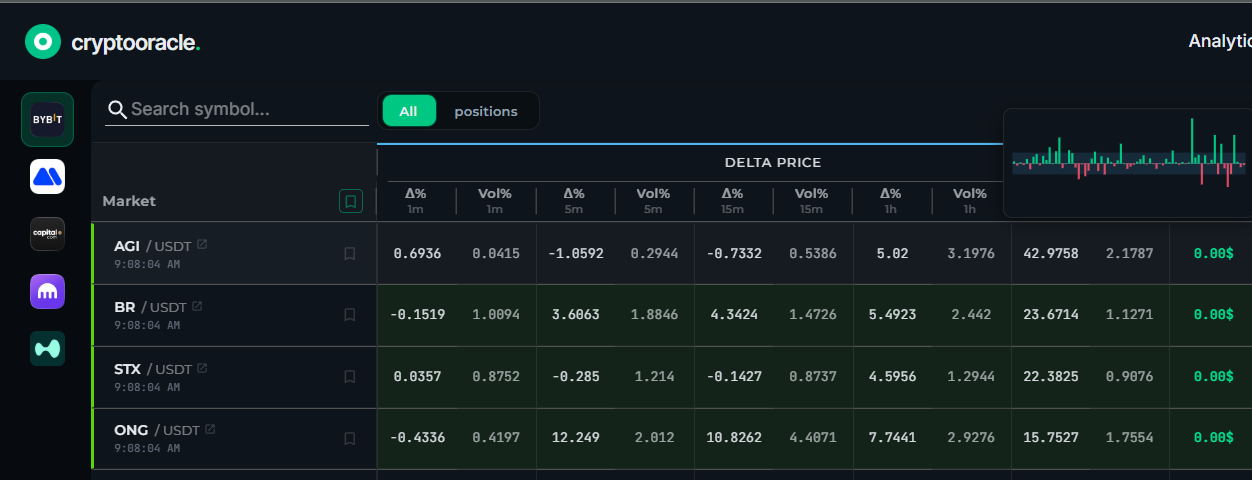
This distinction matters more than it sounds. A volatility reading of 0.38 tells you how much a coin moved. It does not tell you whether that was one violent spike in otherwise calm trade, or six hours of relentless chop. Those two demand opposite decisions about stop placement and position size, and the single number hides which one you are looking at. The bars do not.
The chart is the number
A fast glance is only worth taking if you can trust it, so each chart is drawn from exactly the data its number was computed from — the same window, the same source series. When we tested it, the standard deviation of the plotted bars matched the figure in the cell to four decimal places.
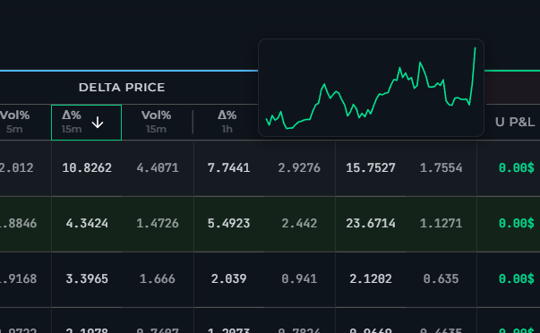
That also means a short timeframe gives you a short chart. A 5-minute cell measures a move across a handful of data points, so that is what you see — no smoothing, no padding out to a prettier curve.
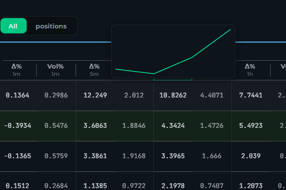
Pairs quoted in USDC, USD1 and USD take their published figures from the USDT pair of the same coin, and their charts now follow that same source, so the picture beside a number cannot contradict it. Where no matching history exists, we show no chart at all rather than a plausible-looking one drawn from a different series.
Where it works
The charts are live now for all CryptoOracle users across Bybit, MEXC, Capital.com, Kraken and Hyperliquid, on the 5-minute, 15-minute, 1-hour and 6-hour columns, plus 1-day and 1-week on Capital.com instruments. The underlying series carries one data point every five minutes.
The 1-minute column has no chart, deliberately. Its delta spans a single data point and its volatility is not a standard deviation, so there is nothing honest to draw.